8 out of 10 people searching for your service in Tenerife are doing it on their phone. Right now. While walking down the street. Sitting in a café. On the beach.
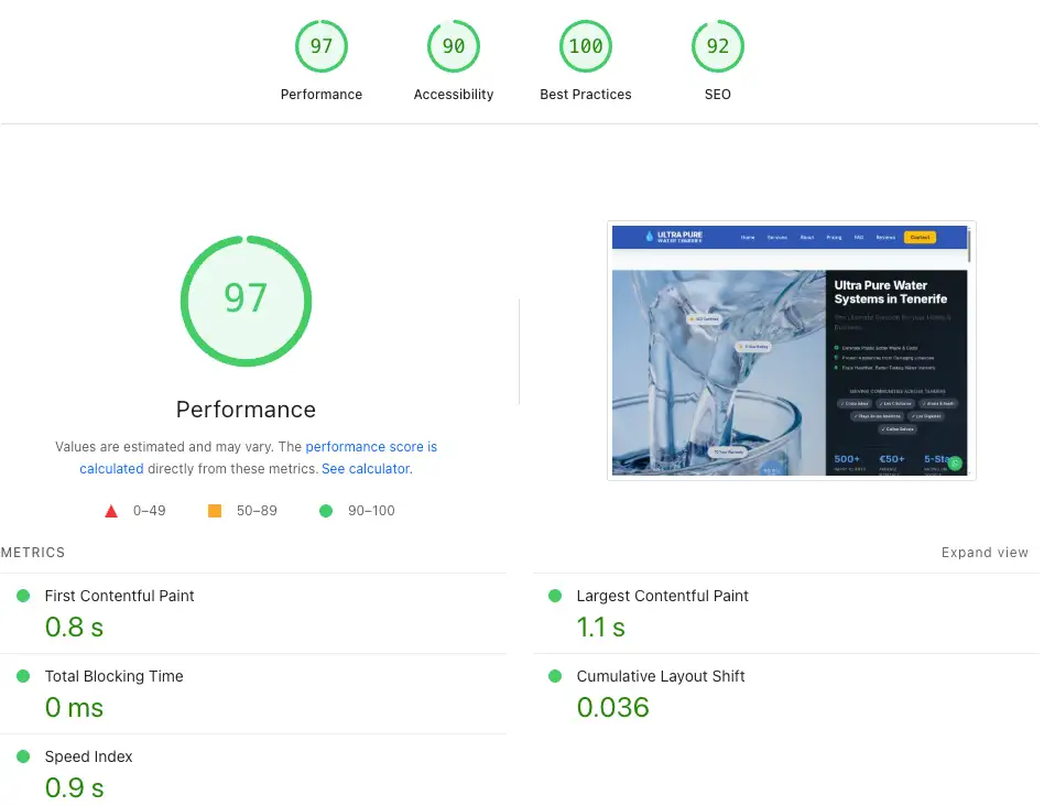
And your website? It probably looks poor on mobile. You're losing 80% of potential customers before they even see your phone number. You need speed. This 100% performance is a local client Ultra Pure Water Tenerife owned by Adam See.
The Mobile Reality in Tenerife
Let's start with the uncomfortable truth:
Mobile Search Statistics (Tenerife 2025)
- 82% of local service searches happen on mobile devices
- 76% of people who search on mobile visit a business within 24 hours
- 28% of those searches result in a booking
- 53% of mobile users abandon sites that take longer than 3 seconds to load
Translation: If your site doesn't work perfectly on phones, you're invisible to 8 out of 10 potential customers.
How Customer Behaviour Has Changed
Ten years ago, people searched on their laptop at home. They'd compare options, make notes, call the next day.
Now? They search while the problem is happening:
- "Shit, the sink is leaking" → searches "plumber costa adeje" → books within 10 minutes
- "Need massage tomorrow" → searches "massage los cristianos" → WhatsApp message sent immediately
- "Moving next week" → searches "removal company tenerife" → calls the first mobile-friendly site
They're not doing research. They're solving a problem RIGHT NOW. On their phone.
Why Most Tenerife Business Websites Fail on Mobile
1. Tiny Text You Need a Magnifying Glass to Read
Your designer made it look pretty on their 27-inch monitor. On an iPhone? The text is 8 pixels high. Nobody's pinching and zooming to read your service description.
2. Buttons Too Small to Actually Tap
That "Contact Us" button looks fine on desktop. On mobile? It's the size of a grain of rice. Users tap three times, get frustrated, and go to your competitor.
3. Horizontal Scrolling (The Death Sentence)
If users have to scroll sideways to see your content, they won't. They'll leave in 2 seconds. Google will rank you lower because your "mobile experience" is garbage.
4. Forms That Don't Work
Your contact form has 15 fields. On mobile, filling it out is painful. Nobody finishes. You lose the lead.
5. No WhatsApp Button
Tenerife customers EXPECT WhatsApp contact. It's how business works here. If you don't have a one-tap WhatsApp button on mobile, you're making customers work too hard.
Real Example: Los Cristianos Massage
Before we rebuilt their site with mobile-first design:
- Text too small to read on phones
- No WhatsApp button
- Contact form didn't work on iPhone
- Site took 8 seconds to load on 4G
After mobile-first redesign:
- One-tap WhatsApp booking button (prominent)
- Readable text size (16px minimum)
- Fast loading (2 seconds on 4G)
- Touch-friendly buttons (minimum 44x44px)
Result: Page 1 Google rankings in 14 days. 4.54% click-through rate (industry average is 2%).
What "Mobile-First" Actually Means
It's not just "making your site work on phones." It's designing FOR phones FIRST, then adapting for desktop.
Mobile-First Design Principles:
1. Content Priority
What's the ONE thing mobile users need? Put it at the top. For service businesses in Tenerife:
- Your phone number (clickable)
- WhatsApp button (one-tap)
- What you do (in 10 words or less)
- Your service areas (Costa Adeje, Los Cristianos, etc.)
2. Thumb-Friendly Navigation
People hold phones in one hand, thumb on screen. Your buttons need to be:
- Big enough to tap easily (minimum 44x44 pixels)
- In thumb-reach zones (bottom of screen)
- Spaced apart (no accidental clicks)
3. Speed Above Everything
4G in Tenerife isn't always fast. Your site needs to load in under 3 seconds or users abandon.
Speed Testing
Go to your website on your phone. Count to 3. If it's not fully loaded, you're losing customers. Every. Single. Day.
4. One-Column Layouts
Forget fancy multi-column designs on mobile. One column. Top to bottom. Simple. Scannable. Fast.
5. Minimal Form Fields
Every field you add to a form reduces completions by 10%. On mobile, ask for:
- Name
- Phone or WhatsApp
- Brief message
That's it. You can get details later when they're actually a customer.
How We Build Mobile-First Websites
Every website we build starts on mobile. Here's the process:
Step 1: Design for iPhone First
Not desktop. Not iPad. iPhone. It's the most restrictive screen size. If it works on iPhone, it works everywhere.
Step 2: Test on Actual Devices
Not browser simulators. Real phones. Real 4G connections. Real thumb-tapping.
Step 3: Optimize for Speed
Compress images. Minimize code. Use fast hosting. Target: under 3 seconds load time on 4G.
Step 4: WhatsApp Integration
Floating WhatsApp button. Always visible. One tap to message. Pre-filled with relevant info (service requested, page they're on).
Step 5: Test the Conversion Path
Can someone go from landing on the homepage to contacting you in under 30 seconds? On their phone? While walking? If no, redesign.
Real Mobile-First Results
Man with Van Tenerife
Mobile-first redesign focused on instant WhatsApp booking:
- 40% more bookings in 3 months
- 100% of bookings tracked (no missed calls)
- Users book in average 45 seconds from landing
Ultra Pure Water
Mobile-first design for technical product (water filtration):
- Zero to 30 customers in 90 days
- 10.84% click-through rate (industry average is 3%)
- €800 first cash deal in week 2
How to Test Your Website Right Now
The 30-Second Mobile Test:
- Open your website on your phone (NOT on WiFi, use 4G)
- Can you read the text without zooming?
- Can you tap the contact button easily?
- Can you send a WhatsApp message in one tap?
- Does the whole site load in under 3 seconds?
If you answered "no" to ANY of these, your site is costing you money every single day.
The €649 Mobile-First Package
Every website we build is mobile-first by default. You get:
- Designed for iPhone first, desktop second
- One-tap WhatsApp integration
- Speed optimized (under 3 seconds load time)
- Touch-friendly buttons and navigation
- Tested on real devices (not just simulators)
- Google Mobile-Friendly certification
Zero monthly fees. Your website, your rules, forever.
If you want to see exactly what a mobile-first Tenerife website looks like in practice, take a look at our web design Tenerife service page — every element is built for mobile performance and Google rankings.
Ready for a Mobile-First Website That Actually Converts?
Stop losing 80% of customers to competitors. Get a free analysis of your current site and see exactly what it would take to dominate mobile search in Tenerife.
Get Your Free Analysis